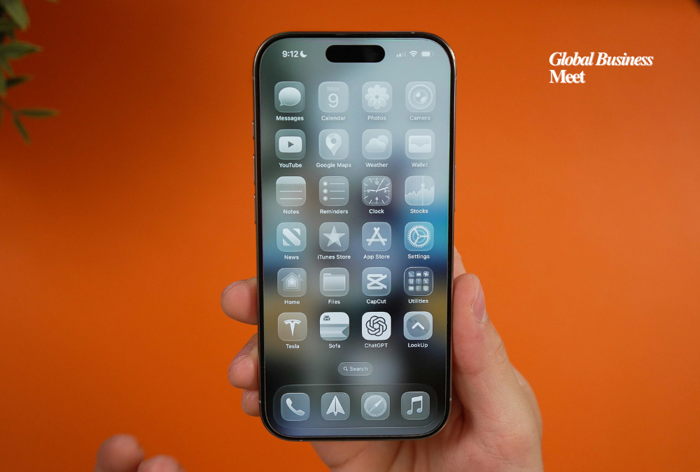
Apple has introduced a new setting allowing users to customize the look of the Liquid Glass interface. With the latest beta updates for iOS 26.1, iPadOS 26.1, and macOS 26.1, users can now choose between Clear and Tinted options, giving them more control over the appearance of interface elements across Apple devices.
Listening to User Feedback
Liquid Glass, launched with iOS 26, marked Apple’s biggest interface redesign since 2013. While many users praised its modernized appearance and enhanced visual depth, some found certain elements difficult to read. Notifications, navigation controls, Apple Music components, and other translucent elements were noted as less visible for some users.
Apple has a history of addressing user concerns when introducing controversial design changes. For instance, in 2021, it moved Safari’s address bar to the bottom of the screen, and after feedback, added an option to revert it to the top. Similarly, the new Tinted option shows Apple’s commitment to balancing innovative design with usability.
How the Tinted Option Works
The Tinted feature increases the opacity of Liquid Glass elements, making interface components easier to see. Users can access the new setting via Display & Brightness on iPhone and iPad, and under Appearance in System Settings on Mac. A simple toggle lets users select between Clear and Tinted, offering two preset levels of transparency.
Although some users requested a slider for more precise control, Apple opted for a straightforward toggle to simplify the experience. Apps that have already implemented Liquid Glass will automatically adopt the user’s selected setting, ensuring a consistent interface across Apple and third-party applications.
System-Wide Effects
The Tinted setting affects multiple system interface elements, including Now Playing controls, Lock Screen notifications, and menu systems. Third-party apps using Liquid Glass can also respect the user’s choice, delivering a more readable and personalized experience across devices.
The feature was initially released in the developer beta, with the public beta expected in the coming days. Once the wider release is live, all users will be able to select their preferred interface appearance.
The Bigger Picture
Liquid Glass reflects Apple’s ongoing effort to modernize its operating systems while maintaining both aesthetic appeal and usability. The Tinted option highlights the company’s recognition that readability and accessibility are as important as visual innovation.
Design decisions like these are increasingly important as devices serve multiple purposes—from work productivity to entertainment. Allowing users to control interface visibility ensures that Apple’s design updates can be widely adopted without compromising functionality or legibility.
Early Reception
Although it is too early to measure widespread adoption, early feedback is positive. Users who previously struggled with reading text over highly translucent backgrounds appreciate the ability to switch to Tinted for better visibility.
Apple’s approach of providing fallback options for major design changes demonstrates careful attention to user experience. This strategy allows for innovation without alienating users who prefer more conventional or practical designs.
Looking Ahead
As Apple continues refining iOS, iPadOS, and macOS, additional customization features are likely. The company’s approach balances pushing design boundaries with ensuring accessibility and usability. With the Tinted option, users can enjoy the sleek aesthetics of Liquid Glass while maintaining better visibility and readability across the system.

